
Data Wrangling — Some Tips during this covid season

In this covid season, thought of sharing some tips and sample codes on Data Wrangling. After getting a glance of Google Colab, my go to language for data wrangling has been Python. This blog hence uses Colab and Pandas on Python for data wrangling.

Most of the data collected has format related issues because they are collected without the use of a software. These days, with tools like Google Forms coming into picture, it is much better, but when you have old data to deal with in its row form, there is no escape from formatting it and getting it to the shape that you need it to be in.

This blog shows how to use colab, pandas and lambda functions to quickly format some data.

I had written an earlier blog few days back on  and how to import data from excel to Colab. So, I shall skip that part now.

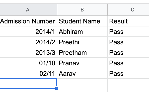
Let us say, the below is the data that we need to format (the admission number column) and we need all the data to be in the format: YYYY-Num

Image for post

We can do this quickly using dataframes and lambda functions in Python.

The below is what we can do to do the transformation:

Import the data into a dataframe using pandas.

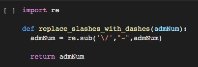
Then, write a normal function in Python which will replace the slash in a string with a “-”. Later, apply a lambda function on the column “Admission Number” and pass this function which we just wrote.

We can repeat the same with another function to format the date. In the second function we can split the data with “-” and check for the format of the year and replace it if required in the YYYY format. Apply this lambda function again on the column which requires the data to be formatted.

The resulting data can be exported to another .csv on the drive too. A piece of demo code is written to show this. The note book has been uploaded to my Github from Colab directly and is available . Below are the screenshots of the relevant pieces of code.

Image for post
Image for post

Might sound simple. But, these simple tools worked like magic on my old Mac with performance issues to transform 1000s of records and to get some “visualisable” data quickly.


Originally posted here

Comments

Popular posts from this blog

How Data Visualization Helps Enhance the Value of Business Intelligence

How Data Visualization Helps Enhance the Value of Business Intelligence By Frank Poladi With massive amounts of data available both internally and externally, making sense of the information isn't easy. However, business intelligence (BI) tools make it easier. With a robust BI solution in place, it becomes possible to mine data from diverse databases for insights, trends, and analysis. Business intelligence is hot right now, but not all BI solutions are created equally. As powerful as these tools are and as richly detailed as reports may be, the results can be difficult for the average manager to decipher - and more importantly, use. Fortunately, it's not necessary to puzzle over stacks of business intelligence reports when you have a solution that includes data visualization tools. What is data visualization? Visualizations are a graphical way of displaying data such as pie charts, bar charts, and trend lines. In addition to these familiar charts and graphs, data vi

The Many Faces of Data Visualization

The Many Faces of Data Visualization By Rich Hunzinger Data Visualization has become one of the common "buzz" phrases swirling around the internet these days. With all of the promises of Big Data and the IoT (Internet of Things), more organizations are making an effort to get more value from the voluminous data they generate. This frequently involves complex analysis - both real time and historical - combined with automation. A key factor in translating this data into actionable information, and thusly into informed action, is the means by which this data is visualized. Will it be seen in real time? And by whom? Will it be displayed in colorful bubble charts and trend graphs? Or will it be embedded in high-detail 3D graphics? What is the goal of the visualization? Is it to share information? Enable collaboration? Empower decision-making? Data visualization might be a popular concept, but we don't all have the same idea about what it means. For many organizations